
The Art of Set Design By Harmony Gibson
A sweeping shot across a suburban road. Children ride bikes beneath towering oaks. Colorful houses line the street. The camera settles on a two-story colonial before drifting through the front door into carefully adorned living rooms and bedrooms, a bustling kitchen, a family beginning its day.
It’s the opening to practically every Spielberg film.
The bright lavender walls of Monica Gellar’s apartment.
The ominous length of identical numbered doors in winding white halls lined with crimson carpeting in the Overlook Hotel.
The zigzag tile with walls of endless red, pleated velvet in Twin Peaks.
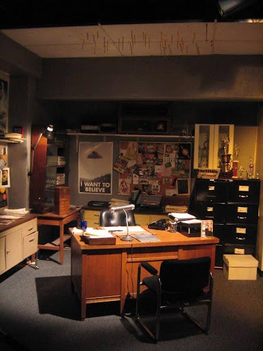
Even Mulder’s basement office with its cramped corner desk lined with stacked files and the iconic I Want to Believe Poster tacked onto the wall.
An establishing shot or a viscerally memorable space that takes you into a place, into a moment, that feels lived in before the story’s even begun.
This is a love letter to those spaces. To the art of set design. To storytelling elements told in an unspoken visual language.
Because a set isn’t just a backdrop. It transforms a setting; a city, a house, a room; into a place that feel lived in, one that existed long before even the story might have. A set tells a story before a character speaks, it’s a story within a story. And sometimes it’s a character in and of itself.
Setting is Storytelling
How does set design become a conduit for storytelling? What do we learn about a character or a world from the set?
Let’s take a look at some examples.
Monica Gellar’s iconic purple apartment from ‘Friends.’
Lavender walls, eclectic furniture, cozy curation.

The first thing we notice is the color palette. Warm and cool tones; pairings that might not conventionally belong together and yet somehow feel effortlessly cohesive.
Immediately, we understand that this is a shared space, one where vastly varying personalities coexist in harmony.
The mismatched chairs, painted shelving, exposed brick, and mix of steel and porcelain create a home that feels collected over time, lived in.
The open floor plan reinforces that feeling. The apartment is a gathering place, a watering hole. It's a space built for conversation and shared meals.

Nothing appears chosen simply because it is fashionable; every object feels as though it has been accumulated over time, giving the apartment the sense that real people have lived here long before the audience arrived.
Even its textures tell a story. Rustic brick and natural wood are softened by floral patterns, colorful accents, and plush furnishings, creating a balance between masculine and feminine influences that mirrors the mix of personalities that occupy it.
From the set alone, we can begin to imagine the people who live here. Before Monica ever cooks dinner, before Rachel rushes through the front door, before Joey wanders in unannounced, the apartment has already introduced them.
It establishes the tone of the series itself: warm, welcoming, eclectic, communal; the apartment becomes a home from the people who live there, and the friendships become family in the same right.
Alternatively, let’s examine a set from an entirely opposing work:
The Overlook Hotel
from one of the most well-known visual works in horror: Kubrick’s The Shining.

The Overlook is a stifling, oppressive place that seems to exist within its own set of rules. The visual design of it is meant to reflect the physical and mental confinement that not only the protagonist feels, but the characters affected by him do.
At first glance, the set seems to exude this perfectly. The repetitive monochromatic walls lined with dak mirrored doorways sealed shut. The disorienting crimson pattern on the floor, a design that at once feels dated yet timeless, evocative of a time or place that has always existed and yet feels like a memory. The tall plant peeking from the corner at the very end, as if afraid or hiding.
At once, the set evokes a feeling of discomfort yet familiarity, and the colors are unsettling, reminiscent of ichor, both fresh and faded as the rug is formed from bright red to rusty brown. The set does the heavy lifting, tells us about the hotel without much needing to be said.
Finally, when examining a more intimate space, we can look to the equally iconic space from the exceedingly popular nineties television hit The Xfiles:
Mulder’s Office

The space holds one of the most familiar set pieces maybe in all of television: the famous ‘I WANT TO BELIEVE’ poster. But looking closer, we learn more about the character: immediately, we see a cramped desk in a dark enclosed space, trophies adorning the file cabinets in the back, pencils marring the office tile ceiling.
Even without context, we can immediately deduce things about the character: this is a person confined to a desk, curious, a little childish or nostalgic, hardworking and investigative, but restricted somehow. The web of tacked files, burry photographs, small pieces pinned together paints the picture of a person following a trail over a long period, collecting bits along the way.
Monica's apartment welcomes us. The Overlook stifles us. Mulder's office obsesses us. Three radically different stories, yet each begins by allowing its setting to speak before its characters ever do.
We see how these sets shape the character of not only the work, but the people who reside within it. These spaces become the foundation, the invite into a world that doesn’t feel built, but lived in, that we are discovering but which has existed beyond the immediate narrative.
What makes these places memorable isn't necessarily the aesthetic or complexity.
They possess a visual identity so distinct that a single frame of a lavender wall, a geometric carpet, a faded poster, is enough to transport us back into their worlds.
…
The best set design isn't just recognizable; but intertwined with and definitive of the story itself.
Is Set Design A Lost Art?
Some of my absolute favorite sets come from the nostalgic films of childhood. Spaces like
THE WHIMSICAL HOME IN ‘PENELOPE’
 The chartreuse walls lined with collage spirals and entomology terrariums, colorful
paperbacks, hand-painted motifs, and a towering fuchsia papier-mâché tree.The space paints a picture of the wonderfully curious, strange, and singular Penelope. More than that, they immediately establish the film's whimsical fairytale tone.
Before Penelope ever speaks, her home has already introduced her.
But as we veer into a CGI-dominated world,
Have we lost sight of set design as one of cinema's most important storytelling tools?
Maybe not as much as we might think.
It’s true, Computer-generated imagery has allowed filmmakers to create impossible worlds, sprawling cityscapes, creatures that could never exist physically.
At most, CGI expands a world. Set design remains the main tool for grounding a work and creating visual style and iconography within a work.
Even the most technologically ambitious productions still rely on production design to give audiences something real to connect with.
It is the set that establishes atmosphere, creates visual identity, and convinces us that a fictional place existed long before the audience is introduced to it.
Memorable spaces remain just as powerful today as they were decades ago in contemporary productions.

Netflix's Wednesday
became instantly recognizable through its dualistic pastel versus monochrome room, visually introducing Wednesday and Enid's opposing yet complementary characters which fuels the narrative, before either character needed to explain them.

Backrooms
demonstrates how atmosphere emerges almost entirely from space itself, utilizing its distinct, liminal visual style to exemplify how intrinsic spaces are to the human psyche.
The Iron Throne

remains one of popular culture's most standing visual symbols, embodying the weight and sacrifice of power and Game of Thrones’ central message with a single set piece.
And perhaps no recent television image became more iconic than

the string-light wall in Stranger Things;
ordinary household objects transformed into a mother's desperate attempt to communicate with her missing son, creating one of the defining visual motifs of modern television.
These are the images that stay with us, the spaces that remain. Because of how they make us feel.
They shape a story without words, they reveal character, atmosphere, and history.
At the end of it all, humans are incredibly good at reading spaces. We walk into someone's home and instinctively notice books on shelves, family photographs, shoes by the door, clutter, light, color, smells. Even if it isn’t conscious,
we are deeply affected by environment. Set design is about harnessing that instinct, constructing fictional spaces that our brains interpret as authentic long before we've consciously realized why.
Whether we know it or not, we respond to that. We resonate most with stories that touch on it and recognize it and incorporate it thoughtfully.
So,
I don't think set design will ever become a lost art.
No matter how advanced filmmaking becomes.
Because long after we've forgotten individual scenes or lines of dialogue, crazy creatures or action sequences, we still remember the places. And those spaces are what tell the story best.
HG
1 Comment
Great insights from the writer! I loved the breakdowns from each set example. These are things that we subconsciously acknowledge when consuming media that add to the authenticity of a story. It is a necessity!