
Opposites Attract: The Rise of Color Coding Characters By Natalie Pool
By Natalie Pool
In modern cinema, especially within larger fandoms, characters have become associated with a certain color, which leads to fans looking deeper, maybe too deep, into how those colors mix and what it could mean for future storylines.

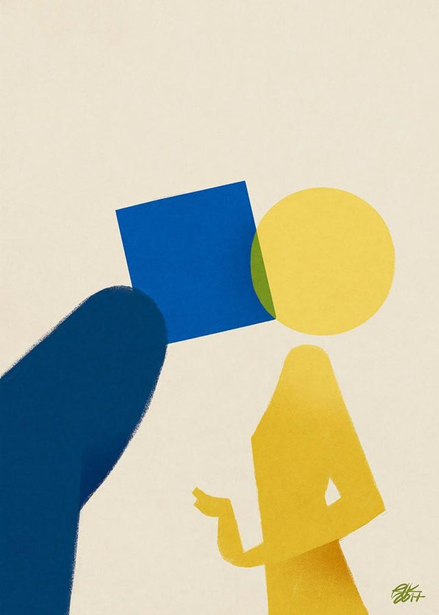
Blue and yellow, red and blue, orange and green- all of these color combinations on the color wheel complement each other perfectly. They are the ultimate epitome of “opposites attract” as they are on opposing sides of the wheel, but when they come together, they create a beautiful hue that clicks in our brains. While color symbolism is important in filmmaking, color coding has become more widely recognized through recent developments in storytelling and in what is shown in film and television. Widely popular in large fandoms, the concept of color coding has become almost rage-inducing among fans, who use these colors to indicate relationships and plotlines between characters. Even on screen, when two characters are color-coded to indicate their relationship, the colors look cohesive, allowing the audience to deem those characters compatible. This concept has become popular, especially in media depicting queer couples, almost as a way to subtextually show their relationship without explicitly stating it on screen.
One of the earliest and most popular instances of color-coding queer couples comes from the series Voltron: Legendary Defender, between the characters Keith Kogane and Lance McClain. This relationship was often associated with the color combination of red and blue, which blended into purple when they were most connected in the series. As with many relationships on television, they never pursued a romantic connection despite fan speculation, which caused an uproar among fans seeking representation in the series and was almost a trick by the writers and producers. This raises the question of whether color-coding was used in place of on-screen depictions of relationships because filmmakers are too scared or simply don’t want to show those relationships. Using colors as a replacement for those connections, while smart in theory, introduces a new set of issues for the fight for representation in media, as those relationships are implied but never explicitly shown, leaving those who might find comfort in those character arcs and relationships in the dark.

Heated Rivalry took the world by storm this past Winter as fans, especially older teenagers and young adults, went wild over the fact that Shane and Ilya, played by Hudson Williams and Connor Storrie, were two hockey players on opposing teams who found a deep romantic connection over the course of ten years. Similar to Voltron: Legendary Defender, Shane and Ilya are most often associated with red and blue as a visual cue for their relationship. While Heated Rivalry is one of the most influential and groundbreaking shows released this year, it is a show made purely to make a statement about being queer in more “straight” environments, such as the National Hockey League. What about representing queer relationships in media we may not expect?

For the last ten years, Stranger Things has held the minds of most people captive not only because of its complex mythology but also because of its ability to make statements about society both in the 1980s and now. The show’s creators had a good reputation for bringing different experiences to the table, such as the character Robin, who identified as a lesbian in the 80s, and Lucas, a black boy living in a predominantly white town not long after the Civil Rights Movement. This got audiences excited to see a new kind of representation in media that was well known across all demographics. When the writers began planting the idea that the main character, Will, was questioning his sexuality as early as season three, people leaned in closer, assuming he would get a proper ending that would resonate with millions of viewers.

Will’s relationship with his best friend, Mike, began to seem as though they were both hiding deeper feelings for each other, as since season one, they both cared about each other on a grander level than the rest of their friends. This ultimately paid off in season four when it was made clear that Will had definite feelings for Mike and was seriously questioning his sexuality. Since the beginning, Will has always been associated with the color yellow, and Mike with blue, with multiple scenes showing that when they wear each other’s colors, they are most bonded. This led fans on a will-they-won’t-they journey, as it was visually evident that their relationship was more than platonic, which got fans riled up for the final season, expecting Will and Mike to break the tension finally. When the ending of their storyline was almost disrespectful to those who connected with Will and Mike’s relationship, it became clear that the color-coding was not only cueing a relationship but ultimately replacing it.
While color-coding, in theory, is great for visuals and storytelling, it has the potential to become a dangerous strategy when it comes to relationships and storylines, as it can bypass true connections and take advantage of the audience’s tendency to feed into narratives that are clearly planted in hopes of more conversation about the project rather than the relationship and its call for representation. While it may seem like a connection is set in stone, you might be watching the intertwining of colors rather than that of characters’ lives.
0 Comments
There are no comments yet. Be the first one to post one!