
The Modern Book Cover By Harmony Gibson
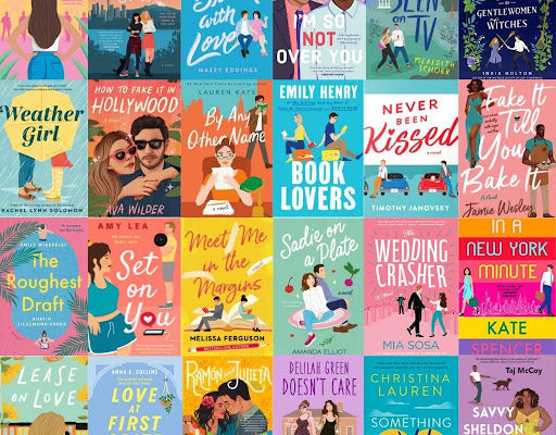

When you walk into a bookstore these days, it almost seems like every modern genre book cover is entirely interchangeable. In romance, it’s all oversaturation, minimalistic colorblocking and simply drawn figures with organic fonts. In fantasy romance, it’s all swords, dark florals and intertwining thorned vines framing ornate text and serpentine or celestial motifs. Even the titles seem to share a format— some sort of gimmicky or alliterative pun in attempted iambic meter, or in romantic fantasy simply “A [blank] of [blank] and [blank].

It’s true that genre fiction has always tended to lean toward shared cover art styles. In the 90ls, pulpy romances featured hand painted or photographed couples in billowy flowing dresses and half-shirtless men, or similar slanting script over satiny textures or dreamy landscapes.

But what’s changed the most in this shift towards the modern romance cover is how much a reader can glean about its contents solely from said cover.
Whether we like it or not, I think it’s safe to say that while we might not always judge a book by its cover, we can certainly understand whether or not the contents or atmosphere suggested by its art will be fitting for us as readers.
However, what I find most disorienting about today’s romance cover art is how disarming it is, no matter the content.
The 90’s and 2000/2010’s might have leaned into the raunchy and the campy, and even saw a shift in how that flamboyant, yet intimate, romance was portrayed in cover art as trends and pop culture naturally shifted.
The covers went from hand painted and traditionally romantic to more modern, in urban settings with the sexy figures in leather rather than ruffles or photographed in desaturated or monochromatic lighting with sepia filters or double exposed landscapes faded overtop.

And yet despite this shift, the mature content of the novel was still evident from the start.
With contemporary covers, it’s not so straightforward.
Pop culture and social media like the reading-oriented side of TikTok, deemed ‘BookTok’ has contributed to a new rise in readers of the sexy romance genre in particular.
However,
at what point does the cover art become responsible for informing a reader of explicit content?
If one walks into the romance aisle and sees a cover just as unassuming, almost childishly innocent in its simplicity and color scheme, and yet the contents are deeply explicit and elicit the exact opposite sort of tone than the cover presents,
what does that mean about the role that the book cover assumes?

[ Hannah Grace’s Icebreaker is a notoriously ‘spicy’ novel, incredibly popular in the TikTok Book community. ]
What the modern romance cover does more so than communicate the content of a novel is signal its context. That simplistic, colorful design tells us a book is trendy, approachable, marketable and BookTok-approved; but not necessarily whether it's a sweet romantic comedy or an intensely explicit romance.
What are your thoughts on the contemporary romance book cover? Do you find yourself reaching for anything with that classic Emily Henry cover art? Are you ever surprised by the contents versus the cover of a story you’ve read? What are your thoughts on the modern book cover?
-HG
0 Comments
There are no comments yet. Be the first one to post one!